Typography 01 by The Futur
The Futur's Typography 01 is a self-paced online course by Chris Do on contrast, grids, composition and hierarchy in type. Over 6 hours of video with assignments and critiques; $299 one-time, lifetime access.
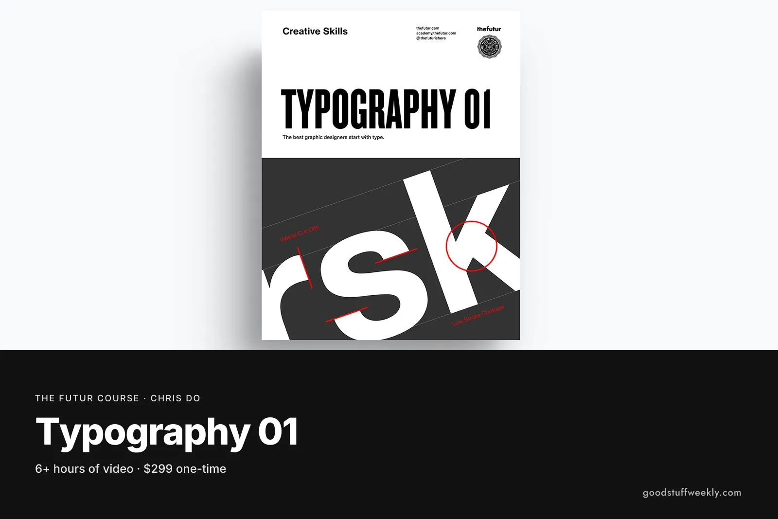
The Futur Typography 01 is a self-paced online course taught by Chris Do, founder of The Futur. It covers the core ideas behind setting type well: repetition and contrast, grid systems, balance, hierarchy and how to choose typefaces. The course includes more than six hours of video, self-study assignments, videos of Chris working through layouts, design critiques and bonus material. It is aimed at beginner to intermediate designers, costs $299 as a one-time purchase and comes with lifetime access.
Typography sits underneath almost every piece of graphic design, from posters and books to websites and brand identities. Many designers pick it up by imitation and never learn why a layout works. This course tries to fill that gap by explaining the principles first, then showing them in practice through demonstrations and critiques. Within The Futur's catalogue it is the natural starting point for anyone who wants their layout and logo work to rest on solid type skills.
What You Will Learn
The course teaches you to make deliberate typographic decisions rather than relying on taste alone. Topics include:
- The history of type and the basic vocabulary designers use
- How repetition and contrast create interest on a page
- Mixing upper and lower case and different point sizes with purpose
- Grid systems, including the approaches of Jan Tschichold and Josef Müller-Brockmann
- How to build a grid and use overlays to check your work
- Balance and hierarchy in a composition
- How to choose typefaces for a project
- How to read and respond to a design critique
Who Is The Futur Typography 01 For?
The short answer: any designer who wants to understand type properly. It suits graphic design students, self-taught designers who want to fill gaps in their training, and working designers whose layouts feel uncertain. Illustrators and photographers who regularly put text on their work may also find it useful.
It is less suited to someone who has never opened design software. The official page recommends knowing Illustrator or InDesign, as the assignments assume you can set and move type confidently. If you are an experienced typographer, the early lessons on contrast and case may feel familiar, although the grid and composition modules go into more depth.
Course Structure
The course is organised into four modules that move from principles to practice:
- Repetition and Contrast: an introduction and short history, the fundamentals, and mixing cases and point sizes
- Grids: the work of Tschichold and Müller-Brockmann, grid construction, terminology and overlays
- Composition: balance and hierarchy, with critiques and live demonstrations
- Advanced Topics: further material that builds on the earlier modules
Alongside the lessons you get self-study assignments, recordings of Chris working on designs, critique videos and bonus videos. Because the course is self-paced, you can move through the modules in order or return to a specific topic, such as grids, when a project calls for it.
Price and Access
The Futur Typography 01 costs $299, paid once. The official page states that access is lifetime, so you can come back to lessons whenever you need a refresher. Prices on The Futur shop can change during sales, so check the official page for the current figure before buying.
About the Instructor
Chris Do is an Emmy award-winning director, designer, strategist and educator, and the founder and CEO of The Futur. He teaches several of The Futur's design courses, including Logo Design 01 and Stylescapes, so his approach is consistent across them.
Things to Consider
- Time: plan for well over six hours, since the assignments take longer than the videos themselves.
- Software: have Illustrator or InDesign installed and know the basics before you start.
- Practice: do every assignment and compare your results with the critique videos; that is where most of the learning happens.
- Feedback: the course gives you recorded critiques rather than personal feedback, so share your exercises with peers or a design community for extra eyes.
- Next steps: within The Futur's catalogue, Grids and Layout (a kit of templates and overlays) and Logo Design 01 pair well with this course.
- Format: this is a principles course, not a font software tutorial, so expect theory backed by examples.
How to Get the Most From It
Treat The Futur Typography 01 as a working studio rather than a playlist. Keep a sketchbook or a folder of layouts, and after each module redo an old project using the new rules. Rebuilding a poster or a page on a proper grid, then comparing it with the original, shows the difference faster than any lecture. Revisit the Composition module before big projects; it is the part most designers return to.
Start the Course
Interested in learning with The Futur?
Start Typography 01
For the full syllabus and pricing, visit the official The Futur website.
Looking for more ways to learn? Browse all courses and learning resources on Good Stuff Weekly.
Last verified: November 9, 2026
Last updated