Lettering by The Futur
The Futur's Lettering is an online video course by ArtCenter type instructor Nils Lindstrom: old style and blackletter forms, compositions on paper and vectorising in Illustrator. 4 hours of video; $199.
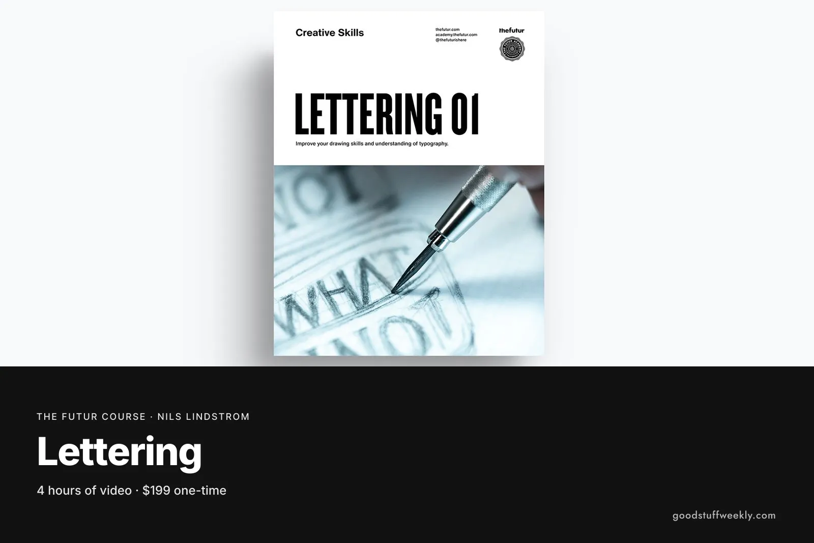
The Futur Lettering is an online video course taught by Nils Lindstrom, a type instructor at ArtCenter College of Design. It starts with the origins of old style letterforms and the terms used to describe them, moves on to blackletter, then teaches you to build lettering compositions on paper and turn them into clean vectors with the pen tool in Illustrator. The course has four hours of video, downloadable materials, practice exercises and bonus critiques of student work. It is aimed at beginner to intermediate learners and costs $199.
Lettering is different from typography: instead of arranging existing fonts, you draw letters for a specific word or phrase. That makes it a valuable skill for logos, packaging, book covers and editorial headlines. What sets this course apart is its classical grounding. Rather than teaching a trendy style, it goes back to how historical letterforms were made, so the shapes you draw rest on proportions that have worked for centuries.
What You Will Learn
The course follows a clear path from history to finished digital artwork:
- Where old style letterforms come from and why they look the way they do
- The vocabulary of type, including old style serif and blackletter forms
- How to observe and draw the structure of individual letters
- Planning and drawing lettering compositions on paper
- Spacing and balancing letters within a composition
- Vectorising hand-drawn lettering in Illustrator with the pen tool
- Learning from critiques of ArtCenter student work
Who Is The Futur Lettering For?
The course suits graphic designers who want to create custom wordmarks and headlines, illustrators who want to add hand-drawn type to their work, and design students looking for a disciplined introduction to letterforms. It also helps anyone who has tried brush lettering and wants a more structural understanding of what makes letters look right.
It is not a calligraphy course with a focus on pens and ink, nor a font production course. If you want to design a full typeface, you will need further study after this.
Course Structure
The official page describes the course as a series of steps rather than numbered modules:
- Origins: the history behind old style letterforms
- Type terms: vocabulary for old style serif and blackletter
- Compositions on paper: sketching and refining lettering by hand
- Vectorising: redrawing your work in Illustrator with the pen tool
- Critiques: reviews of work by students at ArtCenter College of Design
The downloadable materials and practice exercises support each step, so you are drawing from the start rather than only watching.
Price and Access
The Futur Lettering costs $199 as a one-time purchase. The official page we checked did not state an access period, so confirm the terms and the current price on the official page before buying.
About the Instructor
Nils Lindstrom teaches type at ArtCenter College of Design and was classically trained in the late 1970s. He also lettered the Blind logo for Chris Do, a good example of how his hand-drawn approach carries into professional identity work.
Things to Consider
- Materials: you will need paper and pencils for the drawing stages, plus Illustrator, which is recommended for the vector stage.
- Pen tool: if you have never used Illustrator's pen tool, practise basic curves first; the vectorising step assumes some patience with it.
- Time: four hours of video is compact, but lettering improves with repetition, so expect to spend much longer on the exercises.
- Pairing: Typography 01 by Chris Do covers how type works in layouts, while this course covers how individual letters are drawn; together they give a rounded foundation.
- Logos: if your goal is identity work, follow this with Logo Design 01, where word marks and monograms build on lettering skills.
- Feedback: compare your work with the recorded student critiques, and share drafts with other letterers for fresh eyes.
How to Get the Most From It
Choose a single word that matters to you, such as your name or studio name, and redraw it after each section of the course. Keeping every version side by side shows your progress clearly, and the final vector can become a usable wordmark or a portfolio piece.
Start the Course
Interested in learning with The Futur?
Start Lettering
For the full syllabus and pricing, visit the official The Futur website.
Looking for more ways to learn? Browse all courses and learning resources on Good Stuff Weekly.
Last verified: November 9, 2026
Last updated


